
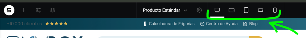
Once you have some content on your container, the bar on top will show you how your elements are being printed on each device, so you can adjust one by one, if needed:
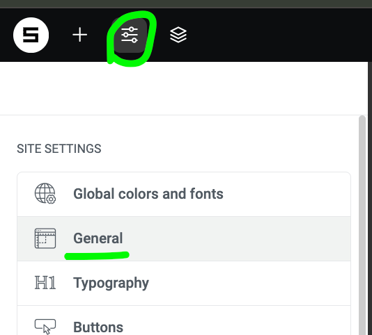
This is the place where you’ll find and can define/change you mobile/responsive preferences:
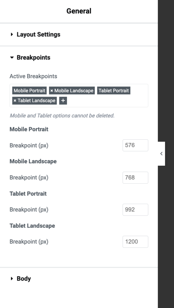
The brakepoints are defined by default, but you can change them in your needings:
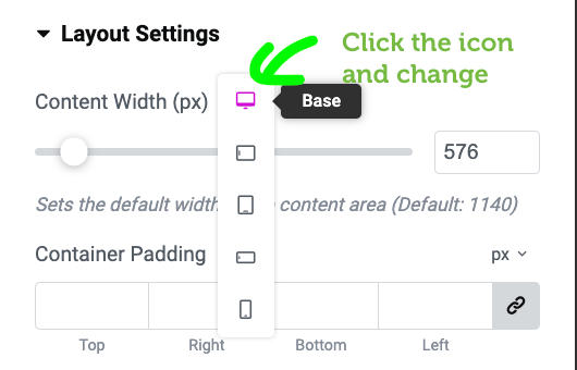
In each element you’ll find this icon. You can click on it and choose different configuration for other devices: